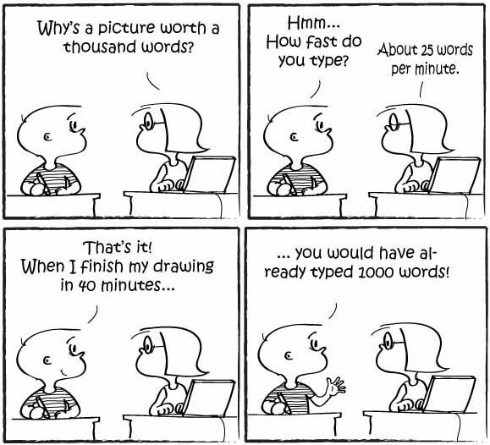
“Use a picture. It’s worth a thousand words.” This timeless expression first appeared in a 1911 Syracuse Post Standard newspaper article. If you ask Mohamad Elgendi, he’ll say it’s more like 10000 words, based on how fast our mind processes words vs. images. Although true for almost everything, this phrase is becoming even more important in the sciences where data visualization is a necessity for clearly communicating complex and large data sets.
The concept of data visualization is simple: it is the representation of data in a graphical or pictorial format. Creating effective data visualizations, however, is quite difficult. Scientists are often tasked with this challenge every day, whether by presenting their work to peers or to the general public through written and oral forms of communication. Data visualizations play a huge role in all of these outputs, so scientists should be pretty good at it, right?
Most scientists would probably say they are decent at preparing figures and graphics for someone that is within their field of study. Beyond just the typical representations of data like bar plots, scatter plots, pie charts, and line graphs, different fields within the life sciences have created various types of plots for representing certain data. For example, protein sequence conservation is sometimes depicted in “sequence logo plots”. But these field specific data representations may not be appropriate for all audiences and branching out to create something that is both visually appealing and effective at conveying the proper message to the right audience is tough.
There are multiple possible explanations for the gap in scientists’ ability to make effective data visualizations. The first is that we simply are not trained in art or graphic design. Additionally, scientists do not always have access to someone, such as a graphic designer, to collaborate with for making figures. Although there are efforts being made, such as this one at the University of Washington, that work to forge collaborations between science and design students. Another factor that introduces a hurdle to scientists making good data visualizations is time. First, a good figure requires a complete and thorough understanding of the data which can take a tremendous amount of time, particularly in the days of big data, where data sets are extremely vast and complex. Finally, it also takes time to create a figure. Creating a beautiful data visualization requires hours of training and working with unfamiliar software, such as Adobe Illustrator, that takes patience and persistence to master.
So scientists need to improve their data visualization skills but it is often difficult to find the time to practice some of these skills. Some helpful beginners tips for data visualization are shown below because the goal is always the same.
Goal of data visualization: To create a story from a set of data in a clear manner
How to get there:
-
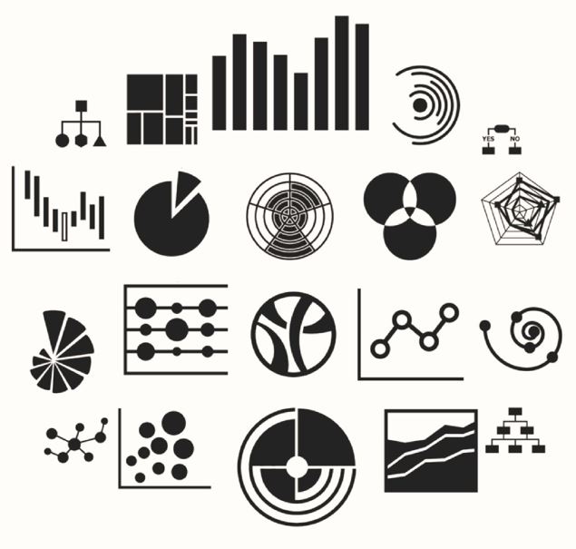 Figure out your narrative, or the story that you want to tell with the data. This requires a comprehensive understanding of the dataset you aim to represent along with the an understanding of your audience.
 - Determine the best way to represent the data. This sounds easier than it actually is and could take some time making and comparing multiple different types of figures. Again remember the story and the audience.
- Learn a little bit about how the brain perceives images, color, and depth. Learning the core principles of design, such as color choice, negative space, and typography, can have an immediate impact on
the visual appearance of the graphic. This document highlights data visualization specifically for the life sciences and Nature has compiled a collection of articles related to design. - Get feedback from everybody. Before finalizing a data visualization make sure to get feedback from multiple people with different backgrounds. Ensure they all interpret the data as you aimed to present it. And, as most things are not perfect the first time, refine and remake until you create your ideal data visualization.
Nearly every scientist hopes to turn the ideas in their head into a beautiful work of art, similar to this process of going from sketch to infographic. It takes time, patience, and practice to develop these skills. If you are a scientist looking to enhance your data visualization skills consider taking an online course, reading up on data visualization, practice making figures from some largely accessible datasets or for your colleagues, entering a contest such as the NSF Vizzies Challenge, or attending a conference or workshop.
Peer edited by Alex Mullins.
Follow us on social media and never miss an article: