Statistics. Ugh. Why force-feed such a dreary topic to countless innocent students across the globe? Well, statistics is actually an outrageously important field of study. People make graphs to summarize statistical results (it’s more useful to look at a graph than a big spreadsheet full of numbers). These graphs can inform important decisions made by voters, politicians, business owners, land managers, and others.
A graph can be worth a thousand words if created thoughtfully. But people may – intentionally or unintentionally – create graphs to express an idea that doesn’t reflect reality. It’s crucial for consumers – that is, everyone – to know how to spot a bad graph when they see one. And let me tell you – bad graphs are everywhere: advertising, newspapers, magazines, internet sites, you name it. It is easy to create a bad graph using many devious techniques, a few of which I’ll describe below.
1. Exaggerating or constricting the y-axis scale
The y-axis (the vertical axis) of a graph shows a range of numbers. Statisticians can modify this range based on aesthetics or clarity. It’s good form to use a scale that considers what the typical measurement could realistically be. For example, a graph showing percentages should range from 0-100%.
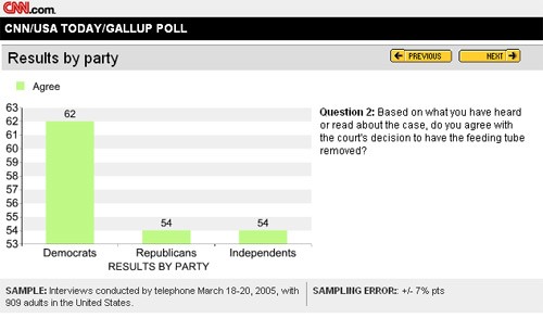
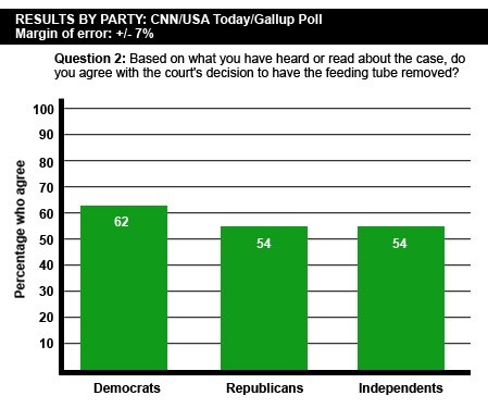
On CNN.com in 2005, the results of a Gallup poll were published using an inappropriate scale for the y-axis (first graph below). After controversy over the misleading “gap” in opinion between Republicans and Democrats, the graph was fixed and reposted (second graph below). Given the margin of error (7%), it’s clearer in the second graph that there is no real difference in opinion between Democrats and Republicans.
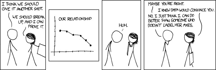
2. Omitting axis labels
The reader can’t possibly understand how to correctly interpret a graph if the axes aren’t labeled (graph below).
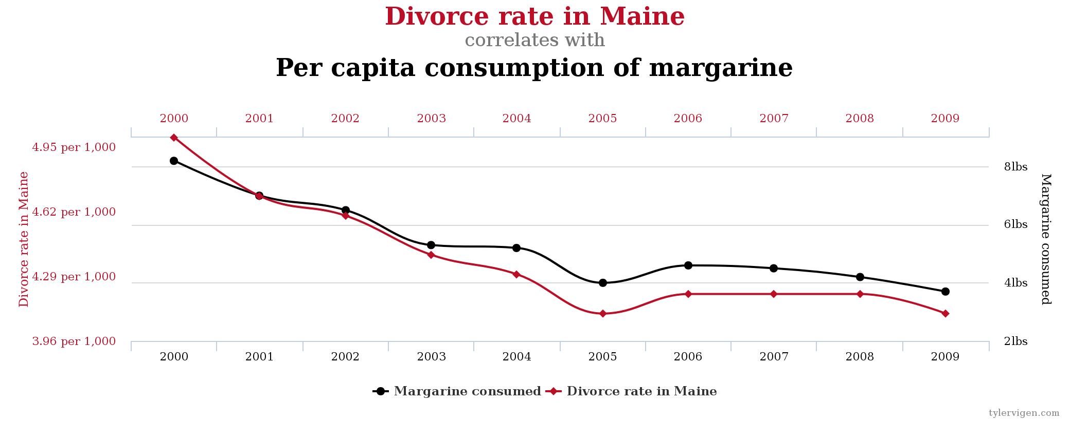
3. Implying causation
You may be familiar with the lovely little statistical poem, “correlation does not equal causation.” It is essential to remember this adage, because sometimes completely ridiculous things can appear to have a relationship.
If two measurements (such as height and weight) are correlated with one another, it means that as one increases, the other also increases (or decreases). But it does not necessarily mean that one thing is causing the other to happen. The graph below shows how margarine consumption is very highly correlated with the divorce rate in Maine. Coincidence? I’ll let you decide for yourself.
4. Fudging the data
The graph below was published online in an article claiming that the number of mass shootings drastically increased during President Obama’s first term. Upon further inspection, a fact-checker discovered that the practitioner who created the graph used a more liberal definition of “mass shooting” only for President Obama’s term, which seriously inflated the count.

Although this type of bad graph is much harder to detect than the previous three, it’s important to remember the relative ease of creating graphs that distort the truth. Happy graphing!
Peer edited by Kelly Carey
Follow us on social media and never miss a Scientific Communication article: