“A picture is worth a thousand words.”
Communication in the written form is frequently accompanied by helpful graphics or attractive pictures. They help the writer explain a point or keep the audience interested. Dissemination of scientific information relies heavily on the use of illustrations to “be a graphical interface between people and data.” If someone is quickly reviewing an article, they may only skim the abstract and examine the figures. Often, these figures incorporate colors to enhance visual contrast and increase appeal. However, about 5% of the population has limited color vision, commonly known as color blindness. This condition limits a person’s ability to discern certain colors, effectively reducing their visual contrast in certain circumstances.
Red-green color blindness is by far the most common type of color vision deficiency and is usually found in males. It follows an X-linked pattern of genetic inheritance, meaning that the DNA responsible for encoding this trait is located on the X-chromosome. Males have one X-chromosome and one Y-chromosome, whereas females have two X-chromosomes. About 8% of females are “carriers” because they have one X-chromosome encoding for color blindness, but their other chromosome allows them to have non-affected vision. Red-green color blindness arises from defects in one of the three variants of cone-shaped cells (cone cells) in the eye’s retina. Cone cells contain photopigments that are responsible for our ability to distinguish different wavelengths of light, or different colors (red, green, and blue). Faults in the cone cells responsible for red and green color detection lead to loss of color information and conditions known as protanomaly and deuteranomaly, respectively. These conditions affect everyday activities, like selecting ripe fruit, choosing a color-coordinated outfit, locating the presenter’s laser pointer dot, or deciphering a journal article.
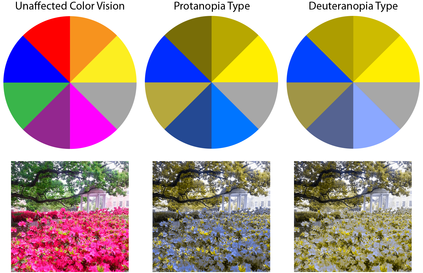
When communicating information with figures, it is important to remember that some individuals have difficulty discriminating between red and green. This handy blog post is full of tips such as recommended color palettes (blue and orange or magenta and turquoise) and combinations to avoid (green with red, brown, blue, or black). Another way to enhance the accessibility of graphics is to use textures (e.g. dashed lines and patterned fill) as opposed to colors. Adobe Illustrator, available for UNC students, allows you to preview your design as it appears to a person with color vision deficiency. Additionally, apps are available for Android and Apple devices to help with this problem. These apps name colors on your screen and use a “daltonize” algorithm to alter the colors in a given image for optimal visualization. So, next time you are making a figure for a paper, presentation, or flyer, take a look through someone else’s eyes.
Peer edited by Nicole Tackmann.
Follow us on social media and never miss an article: