Scientists are working tirelessly to decipher the coronavirus (also known as severe acute respiratory syndrome coronavirus 2, or SARS-CoV-2) behind the highly infectious coronavirus disease (also known as COVID-19). By February 19, 2020, researchers from the University of Texas at Austin and the National Institutes of Health in Maryland released the first map of a vaccine target on SARS-CoV-2. This map helped scientists visualize the distinctive shape of the spike protein vaccine target for the first time. Nine months later, on December 11, 2020, the Food and Drug Administration approved the first messenger RNA (or mRNA) vaccine to help prevent COVID-19 infections. This vaccine was made using technology based on the work of Dr. Katalin Karikó and Dr. Drew Weissman pioneered in their time at the University of Pennsylvania. Today, regardless of scientific background, anyone can explore the SARS-CoV-2 vaccine target millimeter-by-millimeter, a task which continually takes on greater importance as the coronavirus accumulates mutations.
What does the spike protein look like?
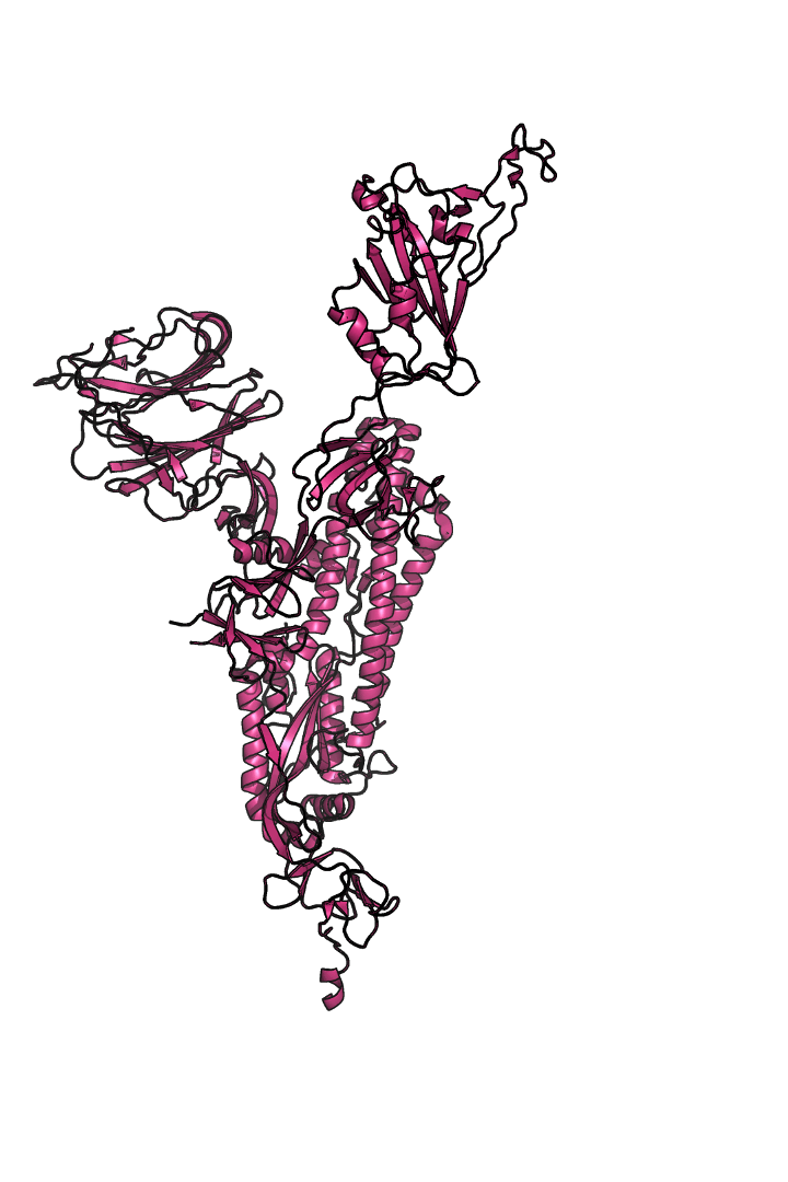
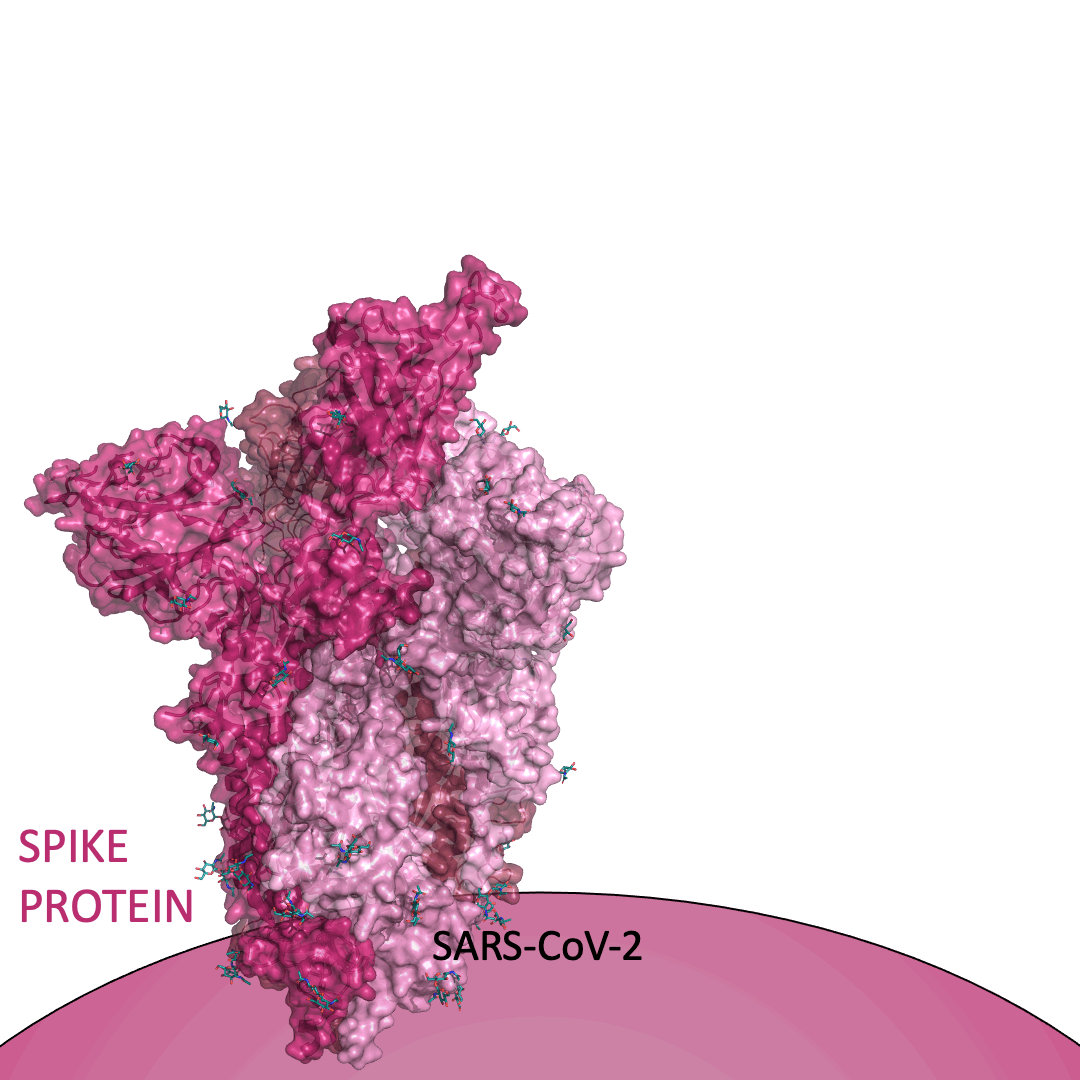
The “spike protein” is short for “homotrimeric spike glycoprotein.” Put simply, the spike protein is composed of three intertwining copies of an identical protein (hence the term “homotrimeric”) that are often found decorated with sugar (or glyco) groups on its outer surface. In more detail, each spike protein copy is built from 1,273 smaller pieces and contains up to 24 sugars on its surface. These seemingly innocent sugars actually shield 40% of the spike protein’s surface, leaving only 60% of the spike protein accessible to antibodies.
The following animation shows cartoon representations of both an individual copy (magenta) and the three intertwined symmetric copies that form the overall spike protein, then reveals the surface representation (a slightly more realistic model) of the spike protein decorated with sugars (teal).
The static structural snapshots shown above cannot capture everything about the spike protein’s shape. Proteins are dynamic structures that vibrate, rotate, drift, sway, wiggle, and “breathe.” This movie predicts the lively (and occasionally unbalanced) movement of the spike protein on the surface of the coronavirus, published by the Wonpil Im research group at Lehigh University.
Why is the spike protein important?
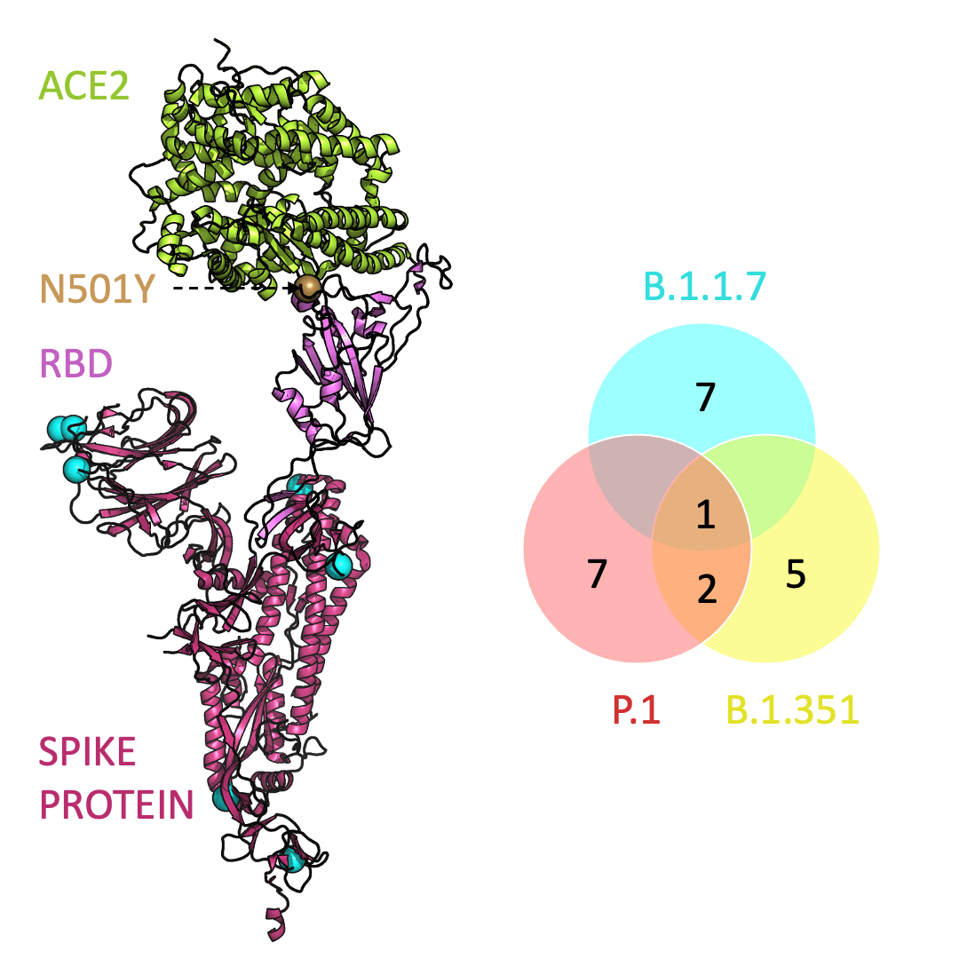
Roughly 26 copies of the spike protein project out from the outer shell of a single virus particle, serving as a collection of arms for the virus. Similarly, healthy cells are dotted with a structure known as Angiotensin I Converting Enzyme 2 (or ACE2) on their surface – which, in the context of the coronavirus, serve as a handle to catch onto. For the coronavirus to enter a healthy cell, the spike protein must latch onto ACE2. This is accomplished using the receptor-binding domain (or RBD) embedded within the spike protein.
Below is an animation highlighting that the RBD (light purple) of the spike protein (magenta) binds to ACE2 (lime green), later allowing SARS-CoV-2 to infect a healthy cell. The RBD region closest to ACE2 is shaped like an arc. The curved indentation wraps around and “hugs” the helical spiral on the edge of ACE2, ensuring a good grasp between the RBD and ACE2.
Can the spike protein change how it grabs ACE2?
Across the world, new SARS-CoV-2 variants are appearing. Each variant contains errors, or mutations, that cause small but crucial changes to the spike protein’s shape. In general, the new configurations can make it easier for the spike protein to latch on more firmly to ACE2.
Three prominent variants, as listed on the up-to-date New York Times’s Coronavirus Variant Tracker website, are B.1.1.7, B.1.351 and P.1. Due to the faster rate of infection, in late January of 2021 the Centers for Disease Control and Prevention projected that B.1.1.7 could become the primary source of infections in the United States by March.
One mutation, known as N501Y, appears in all three variants and is located in the receptor-binding domain of the spike protein. Scientists hypothesize that N501Y helps the spike protein change shape to grab ACE2 better than it could before.
Below is an animation that models and compares the location of each variant’s mutations within the spike protein (magenta), across variants, and relative to ACE2 (lime green); the number of unique and shared mutations in each SARS-CoV-2 variant are listed in the Venn diagram; mutations are shown as spheres on the spike protein, colored according to their position on the Venn diagram (in example, cyan represents a mutation found in B.1.1.7 only; orange represents a mutation found in both B.1.351 and P.1).
What can we do with this information?
You now have the fundamental knowledge to understand the structure of the proteins behind the highly infectious coronavirus disease. Although scientists can reveal the microscopic details of the coronavirus and contribute to the vaccine and treatment development, every individual has a role in preventing the spread of COVID-19. Two critical actions everyone can do moving forward are to support science and stay informed.
All images in this article were made using PyMOL, a molecular visualization software, and the protein structural information stored in the Protein Data Bank as 7DF4 (a snapshot of the spike protein and ACE2 next to each other). The extensive glycan network was modeled using the coordinates stored on GLYCAM-Web as 5.Swiss.5.SiteSpecific.CYX.TER.pdb (published by the Robert J Woods research group at the University of Georgia) onto the 7DF4 spike protein structure. Animations were designed using Microsoft PowerPoint.
Peer edited by Arianna Cascone
Odessa Goudy did a fantastic job explaining the virus. The visions set forth here are captivating and understandable!
This post really helps me envision the virus. The animations are well done. I also like the sentence urging people to “support science and stay informed.”
Great read!! Kudos to Odessa for putting together such an eloquent overview!